After working with hundreds of homeowners and seeing paint trends evolve over my 12-year career, I can confidently say that Benjamin Moore consistently delivers the most sophisticated and lasting color palettes. Their 2025 collection reflects a shift toward warmer, more grounding colors that create sanctuary-like spaces. Here are my top picks for interior paint colors that will define homes in 2025.
Benjamin Moore Color of the Year 2025: Cinnamon Slate (2113-40)
Benjamin Moore’s 2025 Color of the Year is a rich, earthy brown with subtle red undertones. This isn’t your grandmother’s brown – it’s sophisticated, warm, and incredibly versatile.
Why it works: Cinnamon Slate bridges the gap between neutral and bold, offering warmth without overwhelming a space.
Best rooms: Living rooms, dining rooms, home offices, accent walls
Trim pairing: Cloud White (OC-130) or Chantilly Lace (OC-65)
Lighting consideration: Looks stunning in both natural and warm artificial light
My Top 10 Benjamin Moore Interior Colors for 2025
1. Cloud White (OC-130)
This isn’t just any white – it’s the perfect off-white that works in every room and every lighting condition.
Why I love it: Clean without being stark, warm without being yellow
Perfect for: Trim, ceilings, modern kitchens, minimalist spaces
Undertones: Subtle gray undertones prevent it from looking clinical
2. Revere Pewter (HC-172)
The most requested color in my practice for good reason. This greige (gray-beige) is incredibly forgiving and sophisticated.
Why it’s timeless: Works with both warm and cool accent colors
Perfect for: Open floor plans, living rooms, bedrooms
Lighting tip: Adapts beautifully to changing natural light throughout the day
3. Classic Gray (OC-23)
A true, sophisticated gray that’s neither too warm nor too cool. This is my go-to for clients who want something current but not trendy.
Why it works: Clean, contemporary feel without being cold
Perfect for: Modern homes, bathrooms, kitchens with white cabinets
Accent colors: Pairs beautifully with navy, forest green, or warm brass
4. Moonshine (OC-142)
A soft, warm white with just a hint of yellow undertone. Perfect for creating cozy, inviting spaces.
Why it’s trending: Warmer whites are replacing stark cool whites
Perfect for: Bedrooms, nurseries, traditional homes
Complement with: Natural wood tones and cream-colored textiles
5. Balboa Mist (OC-27)
A light, airy gray-beige that creates serene, spa-like environments.
Why I recommend it: Creates calm, peaceful spaces
Perfect for: Bedrooms, bathrooms, meditation spaces
Undertones: Subtle green undertones that work beautifully with plants
6. White Dove (OC-17)
Benjamin Moore’s most popular white for good reason – it’s warm, creamy, and works everywhere.
Why it’s beloved: Warm enough to feel inviting, clean enough to feel fresh
Perfect for: Kitchen cabinets, trim, farmhouse styles
Pro tip: Slightly creamier than Cloud White, perfect for traditional homes
7. Hale Navy (HC-154)
A rich, sophisticated navy that’s become the new black in interior design.
Why it’s trending: Bold enough to make a statement, classic enough to last
Perfect for: Accent walls, home offices, dining rooms
Pair with: Brass fixtures, natural wood, cream colors
8. Nimbus Gray (2131-50)
A soft, sophisticated gray with subtle blue undertones that creates tranquil spaces.
Why it’s special: More interesting than basic gray, less commitment than blue
Perfect for: Bedrooms, powder rooms, reading nooks
Lighting: Gorgeous in north-facing rooms
9. Woodland Brown (2113-30)
A rich, chocolate brown that’s making a major comeback as people crave grounding, earthy colors.
Why brown is back: Creates cozy, cocoon-like spaces
Perfect for: Accent walls, dens, libraries
Balance with: Plenty of white trim and good lighting
10. Sea Haze (2137-50)
A soft blue-gray that brings tranquility and sophistication to any space.
Why it’s calming: The perfect balance of blue and gray
Perfect for: Bedrooms, coastal-style homes, bathrooms
Complement with: White trim and natural textures
2025 Paint Color Trends
Warm Earth Tones
After years of cool grays, we’re seeing a shift toward warmer, earthier colors like terracotta, warm browns, and rich greiges.
Soft, Complex Colors
Instead of pure colors, 2025 favors complex hues with multiple undertones that shift in different lighting.
Grounding Neutrals
Colors that create a sense of calm and stability are increasingly important as people prioritize home as sanctuary.
Biophilic Color Palettes
Colors inspired by nature – sage greens, warm browns, sky blues – connect us to the outdoors.
Color Combinations That Work
Modern Traditional
– Walls: Revere Pewter (HC-172)
– Trim: Cloud White (OC-130)
– Accent: Hale Navy (HC-154)
Warm Contemporary
– Walls: Cinnamon Slate (2113-40)
– Trim: Moonshine (OC-142)
– Accent: Sea Haze (2137-50)
Serene Spa
– Walls: Balboa Mist (OC-27)
– Trim: White Dove (OC-17)
– Accent: Nimbus Gray (2131-50)
Room-by-Room Color Guide
Living Rooms
Choose colors that create conversation and comfort. Revere Pewter, Classic Gray, or Cinnamon Slate work beautifully.
Bedrooms
Opt for calming colors like Balboa Mist, Moonshine, or Sea Haze to promote rest and relaxation.
Kitchens
White cabinets with Cloud White or White Dove remain timeless. For drama, try Hale Navy on an island.
Bathrooms
Light, airy colors like Nimbus Gray or Classic Gray create spa-like environments.
Home Offices
Sophisticated colors like Hale Navy or Woodland Brown create focus and professionalism.
Testing Benjamin Moore Colors
Buy sample sizes: Benjamin Moore’s sample sizes are generous enough for proper testing
Paint large swatches: At least 2×3 feet to see how the color truly looks
Test in different lights: Natural light, incandescent, and LED all affect color appearance
Live with it: Observe the color for several days before making a final decision
Benjamin Moore Paint Quality
Advance Paint
Their premium line offers exceptional coverage and durability. Worth the investment for high-traffic areas.
Regal Select
Great balance of quality and value. My go-to recommendation for most residential projects.
Aura Paint
Top-of-the-line option with superior color retention and one-coat coverage.
Application Tips for Best Results
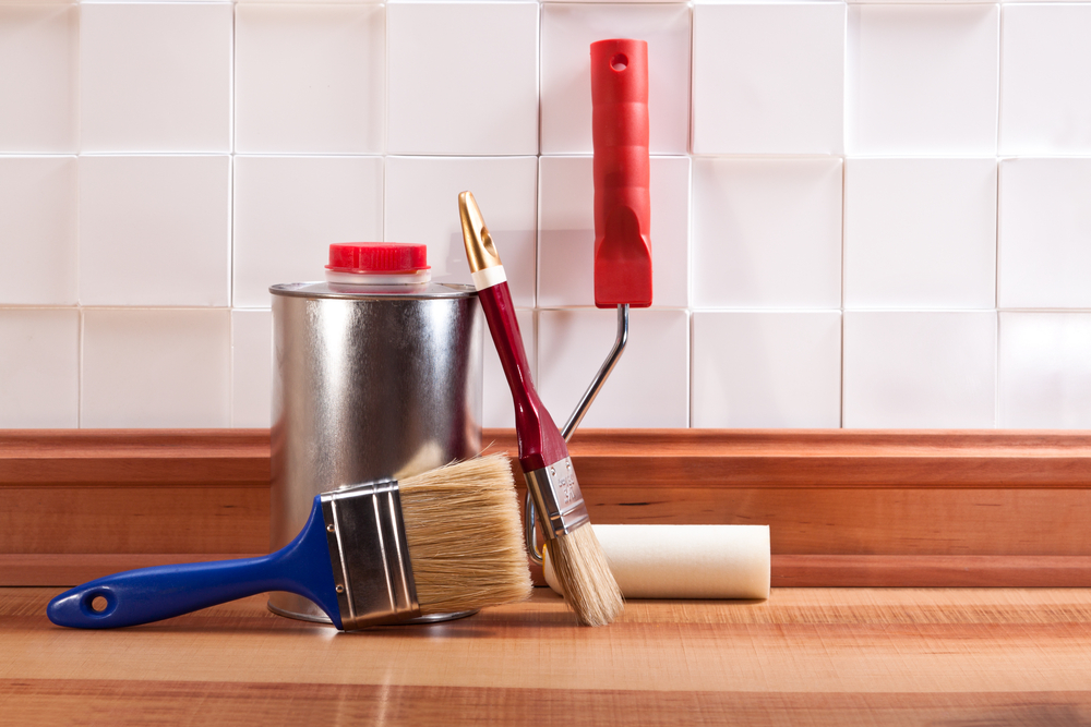
Use quality brushes and rollers: Benjamin Moore colors look best with proper application tools
Prime when needed: Dark colors or dramatic color changes require primer
Two coats minimum: Even with premium paint, two coats ensure even coverage and color depth
Cut in carefully: Clean lines make a huge difference in the final result
Coordinating with Existing Elements
With Oak Cabinets
Warm colors like Revere Pewter or Moonshine complement honey oak beautifully.
With White Cabinets
Almost any color works, but Classic Gray and Balboa Mist are particularly striking.
With Dark Wood Floors
Lighter colors like Cloud White or Sea Haze create beautiful contrast.
Budget-Friendly Color Updates
Accent walls: Use bolder colors like Hale Navy or Cinnamon Slate on one wall
Ceiling color: A soft color on the ceiling adds interest without overwhelming
Built-ins only: Paint just built-in bookcases or cabinets for dramatic impact
Powder room: Small spaces are perfect for trying bold colors
Common Benjamin Moore Color Mistakes
Not considering undertones: Every color has undertones that appear in different lighting
Skipping samples: Colors look completely different on large surfaces than on tiny chips
Ignoring existing elements: Your flooring and furniture affect how paint colors appear
Rushing the decision: Take time to live with samples before committing
Trending Color Combinations for 2025
Earthy Modern
Cinnamon Slate + Cloud White + natural wood accents
Coastal Contemporary
Sea Haze + White Dove + brass fixtures
Warm Minimalist
Moonshine + soft gray accents + natural textures
Final Color Selection Tips
Consider your lifestyle: Busy families need more forgiving colors than empty nesters
Think long-term: Choose colors you’ll love for 5-7 years, not just this season
Start neutral: You can always add bold colors through accessories and art
Trust your instincts: The color that makes you smile when you see it is probably right
Professional Application Recommendations
For best results with Benjamin Moore paints:
– Use their recommended primers
– Follow proper surface preparation
– Apply in optimal temperature and humidity conditions
– Consider hiring professionals for complex color schemes
Benjamin Moore’s 2025 palette reflects our collective desire for homes that feel grounding, sophisticated, and timeless. Whether you choose the bold Cinnamon Slate or the serene Balboa Mist, these colors will create spaces that feel both current and enduring.
The key to success with any paint color is proper testing and understanding how it works in your specific space. Take time to evaluate these colors in your home’s unique lighting and with your existing furnishings for the best results.


